Sunday, 31 July 2011

Preparation for assignment II

The task for assignment to is to create my own personal website. To design a website, first of all i came out with a theme for my personal website which is music. I had created a banner using photoshop for my website and i also used it in my blog as you can see at the part of the blog title. I found some pictures on the web and i edited myself. Combining all those picture and transform it to the size that i want and make some Adjustment on the brightness/contrast and add outer glow, inner shadow and stuff like that.


I chose music as the theme because nowdays music plays a very important part in everybody's life. Music can represent a person's emotion, feelings and also accompany them through happy times or even hard times... Some  people said:" No music, no life." Honestly i agree with it because i feel that music adds a little melody into our life and makes it even more beautiful.

In order to create a website, the software that i will use is Adobe Dreamweaver. Adobe Photoshop and Adobe Flash also required to design the things to place into the website. For the personal website, the information that we are require to put inside are as follows:

1. Biography & Contact

2. GALLERY/GALLERIES } Digital Media Tutorials | Adventures | Hobbies

3. FAVOURITE GAME/S & WHY?

4. FUTURE PLAN/S or YOUR HOPE/S or YOUR DREAM/S

5. FAVOURITE LINK/LINKS

Till here, it's time to get started... 

Thursday, 21 July 2011

Final Phase

After placing all the images, now is the time to do the final touch for the wallpaper which is adding the information about the MMU FOM Open Day that want to present to the viewers.

First of all, use the Horizontal Type Tool to type the words that i want to type. In this case, i wanted to place a slogan under the MMU logo. I came out with a slogan of "Your Path To Successful Career" because of the idea of the two images that i place that form an opening of a door. I want to bring out the idea of behind the door, there is a path that you will be going down and leads you to your successful future.

Next, under the two images, all the information will be provided there about the open day. "Warm Welcome" is written there in order to let people feel that we are friendly and sincerely welcome their coming. Under Wrap Text, I changed the style to Arc and make the phrase bend slightly. After that, date, time and venue is inserted also by using Horizontal Type Tool.

The information are arranged together to form an image of a house and the bending of the "Warm Welcome" forms the roof of the house. This brings the meaning of everyone in this faculty is under one room and the university can be their second home which they can enjoy their studies and have fun together and always welcoming them.

All the texts added the effect of Outer Glow found under the Layer Style so that it becomes more noticeable for the viewers.

So, that's it. Here i m proud to present my final production.=) 

Phase 4

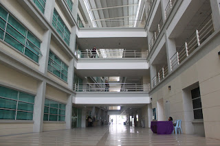
In order to promote and advertise the faculty of FOM, we have to show the sceneries and facilities of the faculty so that people can have a brief view on how the faculty looks like. The next thing to do is copy and paste the image of the FOM building and image of the classroom that previously imported into photoshop onto the background of the wallpaper.

After that transform and scale both the images into smaller size and Distort it to make both of the image a bit slanting. I did this because i want to make it look like an opening of a door in the middle and want to present a message of beyond the door there's a path that will lead you to your future of successful career. 


Anyway, both of the images still need to do some editing work so that will look nicer and more attractive. I start off with the one on the right. Go to image and under Adjustments, select Brightness/Contrast. Increase the brightness of the image and after that go to Vibrance which is also located under Adjustment and increase the Vibrance as well and also slightly increase the saturation. Next, decrease the opacity to make the background slightly visible under the image. Finally under Layer Style, Stroke is added and white color is selected to make a frame for the image so that the image looks more neat and will not clash with the background image.

Next, proceed to the image on the left. The brightness is increased under the Brightness/Contrast so the image looks nicer. Same as the previous image, white Stroke is added under Layer Style and also decrease the opacity of the image. After all those adjustment, the image will look like below.

Wednesday, 20 July 2011

Phase 3

After settling everything for the background, now is the time to add some toppings on it...
I start off with placing the TM logo on the background. Since the color of the TM logo is easy to differentiate, I straight away use the Magic Wand Tool and click it on the white area of the logo. After that, click Select and click on Inverse so it's now selecting the words of the logo. Then, just copy it and past it on the background.

Next, go to transform and scale it. I make it smaller and put it on the bottom right corner of the wallpaper. 


For the next attachment, copy the MMU logo that previously imported into photoshop and paste it in the background as well. After that it will look like this.


 For the MMU logo, under the Layer Style, I added Outer Glow for it to make it has a blur effect so that it looks like the logo is actually merging together with the background picture. In the same time, increase the size of the glow so that you can see that the logo is glowing. 


Now you can compare the difference between the two pictures.

Phase 2

After selecting the background, here comes all the ideas for designing the wallpaper. The background of the wallpaper must be lighter in color so that the things attach on top of it can be more visible for the viewer. In order to do this, decrease the opacity to 65%.

I want to make my wallpaper have a frame. So I add Stroke and change its' color to blue and add blue Inner Shadow and also increase the size of the inner shadow. All of this found under Style Layer. After all those changes, it become something like this.


Phase 1

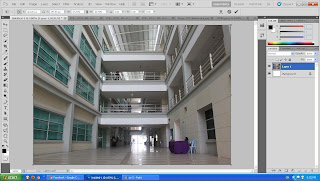
To start with it, first open photoshop and open a new file. Then set the width to 297mm and the height to 210mm... That will be the size of the wallpaper. Next thing to do is to import all the pictures into photoshop for further use. (as shown in the red circle)

The next thing to do is to select a background for the wallpaper. I selected the following picture as my background to start off my wallpaper. 


Copy the image and paste it into the blank page that i had created just now as the size of the wallpaper. To copy the image, i used the Marquee Tool to select the picture by dragging it across the picture. After that use Ctrl+C to copy it and Ctrl+V to paste it. 
Next, go to edit and under free transformation, select scale and scale it till it fits the size that is set. 


Getting Started for the making of e-wallpaper

First of all, in order to do an e-wallpaper, there are things that need to prepare like photos and never the less, photoshop... To get photos about what i will be doing for the e-wallpaper which is the MMU FOM Open Day, i browse through the net to get some and some of it i went to the campus to take it...

After taking all the pictures, now is the time to pick which pictures that i want to use to complete my e-wallpaper... I picked 5 out of those pictures that i had taken. Those pictures that I picked are as follows.


About Me

Brief Information
Name: Kor Qin Sheng
Age: 21
Majoring: Finance with Multimedia
Hometown: Sungai Petani, Kedah
Hobby: playing football
Favorite color: black
Favorite actor: Paul Walker
Favorite singer: Wilber Pan
Likes: eat, listen to songs, football, futsal, cook, snooker... 
Dislikes: have to wake up early in the morning...