Monday, 1 August 2011

The start of the journey of creating my personal website...

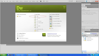
To start with my personal blog, first open Adobe Dreamweaver CS5 and under Create New, click on HTML.


Then on the top bar, click on Site and then New Site. I changed the Site Name to Grake's site and change the Local Site Folder to where i created my folder for this website which i placed on the desktop. After that, under advance setting, i inserted the Default Image folder to where i had created the folder to store the images that i want to use for making the website. Next, just press Save it.


The next thing to do is to save the HTML that had been created. Go to file and save the file as Index.html. The site folder that had been inserted previously will be shown on the right side and after you save the site, it will also appear on the right as well as shown in the red circle. From there you can get images that you want to use to create the website.


The next thing i do is change the title of the site to " Grake - " Music Saves My Soul""


Now, i create a table which consist of 1 row and 1 column under Insert. Under properties, i changed the horz to Center. Then on the right, i clicked on the banner and drag the image that i placed in the folder previously into the table. After doing all that, it will looks like this.


After that i create another table of 1 row and 1 column and also change the Horz into Center. Then, i type in the links that i want to have in this website which is the biography, gallery, favourite games, future plans and favourite link. You can preview your progress by pressing F12 after saving your work.


The title of the site which i key in just now will appear on the top as the website title. The images and the links are all stick to the left side of the site and in order to move it to the center, click on each table and under properties, change the Align into Center so that all of the table will be located to the center.


This is my progress so far, will be updating as soon as possible. Good night...
Sunday, 31 July 2011

Preparation for assignment II

The task for assignment to is to create my own personal website. To design a website, first of all i came out with a theme for my personal website which is music. I had created a banner using photoshop for my website and i also used it in my blog as you can see at the part of the blog title. I found some pictures on the web and i edited myself. Combining all those picture and transform it to the size that i want and make some Adjustment on the brightness/contrast and add outer glow, inner shadow and stuff like that.


I chose music as the theme because nowdays music plays a very important part in everybody's life. Music can represent a person's emotion, feelings and also accompany them through happy times or even hard times... Some  people said:" No music, no life." Honestly i agree with it because i feel that music adds a little melody into our life and makes it even more beautiful.

In order to create a website, the software that i will use is Adobe Dreamweaver. Adobe Photoshop and Adobe Flash also required to design the things to place into the website. For the personal website, the information that we are require to put inside are as follows:

1. Biography & Contact

2. GALLERY/GALLERIES } Digital Media Tutorials | Adventures | Hobbies

3. FAVOURITE GAME/S & WHY?

4. FUTURE PLAN/S or YOUR HOPE/S or YOUR DREAM/S

5. FAVOURITE LINK/LINKS

Till here, it's time to get started... 

Thursday, 21 July 2011

Final Phase

After placing all the images, now is the time to do the final touch for the wallpaper which is adding the information about the MMU FOM Open Day that want to present to the viewers.

First of all, use the Horizontal Type Tool to type the words that i want to type. In this case, i wanted to place a slogan under the MMU logo. I came out with a slogan of "Your Path To Successful Career" because of the idea of the two images that i place that form an opening of a door. I want to bring out the idea of behind the door, there is a path that you will be going down and leads you to your successful future.

Next, under the two images, all the information will be provided there about the open day. "Warm Welcome" is written there in order to let people feel that we are friendly and sincerely welcome their coming. Under Wrap Text, I changed the style to Arc and make the phrase bend slightly. After that, date, time and venue is inserted also by using Horizontal Type Tool.

The information are arranged together to form an image of a house and the bending of the "Warm Welcome" forms the roof of the house. This brings the meaning of everyone in this faculty is under one room and the university can be their second home which they can enjoy their studies and have fun together and always welcoming them.

All the texts added the effect of Outer Glow found under the Layer Style so that it becomes more noticeable for the viewers.

So, that's it. Here i m proud to present my final production.=) 

Phase 4

In order to promote and advertise the faculty of FOM, we have to show the sceneries and facilities of the faculty so that people can have a brief view on how the faculty looks like. The next thing to do is copy and paste the image of the FOM building and image of the classroom that previously imported into photoshop onto the background of the wallpaper.

After that transform and scale both the images into smaller size and Distort it to make both of the image a bit slanting. I did this because i want to make it look like an opening of a door in the middle and want to present a message of beyond the door there's a path that will lead you to your future of successful career. 


Anyway, both of the images still need to do some editing work so that will look nicer and more attractive. I start off with the one on the right. Go to image and under Adjustments, select Brightness/Contrast. Increase the brightness of the image and after that go to Vibrance which is also located under Adjustment and increase the Vibrance as well and also slightly increase the saturation. Next, decrease the opacity to make the background slightly visible under the image. Finally under Layer Style, Stroke is added and white color is selected to make a frame for the image so that the image looks more neat and will not clash with the background image.

Next, proceed to the image on the left. The brightness is increased under the Brightness/Contrast so the image looks nicer. Same as the previous image, white Stroke is added under Layer Style and also decrease the opacity of the image. After all those adjustment, the image will look like below.

Wednesday, 20 July 2011

Phase 3

After settling everything for the background, now is the time to add some toppings on it...
I start off with placing the TM logo on the background. Since the color of the TM logo is easy to differentiate, I straight away use the Magic Wand Tool and click it on the white area of the logo. After that, click Select and click on Inverse so it's now selecting the words of the logo. Then, just copy it and past it on the background.

Next, go to transform and scale it. I make it smaller and put it on the bottom right corner of the wallpaper. 


For the next attachment, copy the MMU logo that previously imported into photoshop and paste it in the background as well. After that it will look like this.


 For the MMU logo, under the Layer Style, I added Outer Glow for it to make it has a blur effect so that it looks like the logo is actually merging together with the background picture. In the same time, increase the size of the glow so that you can see that the logo is glowing. 


Now you can compare the difference between the two pictures.

Phase 2

After selecting the background, here comes all the ideas for designing the wallpaper. The background of the wallpaper must be lighter in color so that the things attach on top of it can be more visible for the viewer. In order to do this, decrease the opacity to 65%.

I want to make my wallpaper have a frame. So I add Stroke and change its' color to blue and add blue Inner Shadow and also increase the size of the inner shadow. All of this found under Style Layer. After all those changes, it become something like this.